It’s been a few weeks since Slack introduced its biggest redesign yet, but the new look is yet to reach all users. The company is going for a gradual rollout, which means you could wake up to the new interface any day now. I finally got the revamped look today, and so did my colleagues — but some of us were a little more surprised than others. “Ugh, this Slack interface is really bothering me,” one colleague exclaimed, commenting on the app’s atrociously bright purple bar. If this sounds familiar, don’t worry: There’s a way to lose the colorful bar.
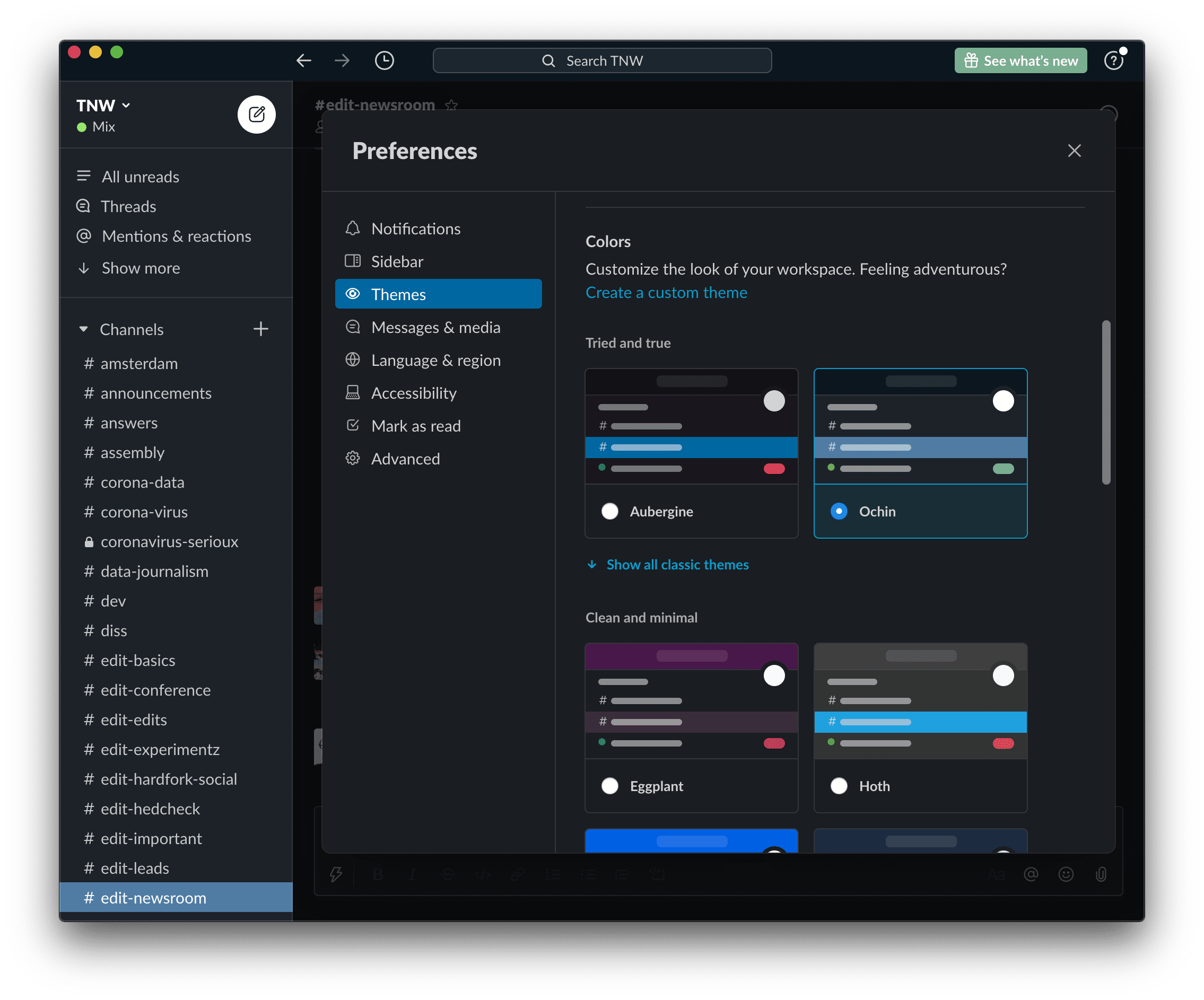
Head to Preferences. Once there, navigate to Themes. In Themes, there’s an option to switch between light and dark mode, but also to customize the colors of your own theme. Choose a color scheme that appeals to your eyeballs, and click on it (I personally went for the classic Ochin look, but you do you). That’ll automatically apply the changes.
Boom, you no longer have to expose your eyes to the putrid sight of bright colors. Wonderful.
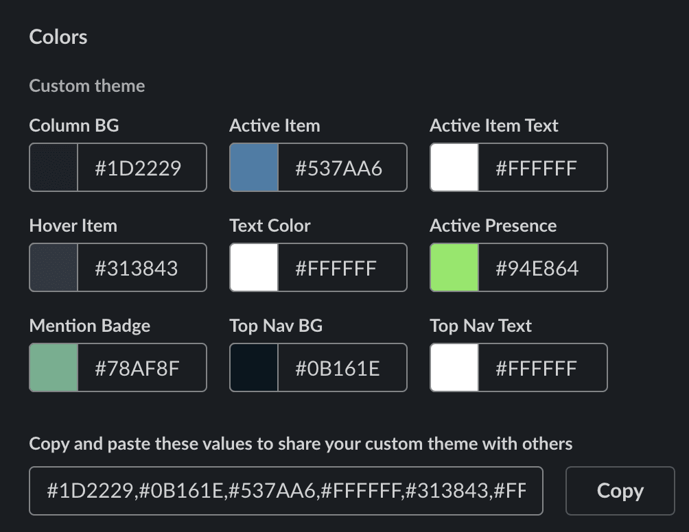
If none of the premade color schemes fit your style, that’s alright — you can create a custom interface. Simply click on the Create a custom theme text, and Slack will let you handpick the colors of each element.
You can even use the Copy button to share your custom design with colleagues. Simply paste the text into any Slack channel or direct message window, and your colleagues can apply your custom interface by clicking the Switch sidebar theme button. Pretty handy.


