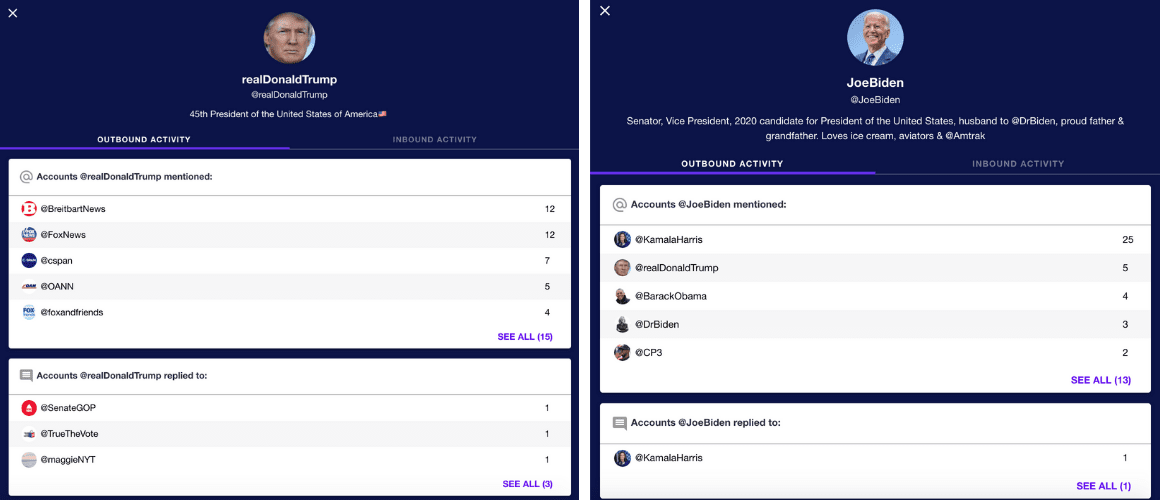
The live graph depicts who the likes of President Trump and Joe Biden are interacting with in the build-up to the 2020 presidential election. It’s designed to expose the networks of influence that can adversely affect elections and offer insights into communities, sectarianism, and suspicious influences. The tool’s creators selected the seed politicians from Twitter lists compiled by C-SPAN (Cable-Satellite Public Affairs Network). They then added the accounts to the graph as circular nodes. You can click on an individual node or search for a Twitter account to explore that user’s connections. Their interactions are divided between outbound activity showing the accounts they’ve mentioned and replied to, and inbound activity displaying the users who have replied to and mentioned them. [Read: 4 ridiculously easy ways you can be more eco-friendly] You can also share any interesting findings with each user and their connections via a direct link. The graph’s developers gave an example of what it can unearth: You can try the tool out for yourself at this link.
